CV Layout Checklist
Formatting does not get you hired. But poor formatting can absolutely get you rejected.
- | 4 min read
Formatting does not get you hired. But poor formatting can absolutely get you rejected.
Recruiters read CVs under time pressure, across different devices, and often inside ATS systems that reformat your document automatically. When layout choices make a CV harder to scan, parse, or trust, recruiters move on—regardless of how strong the content might be.
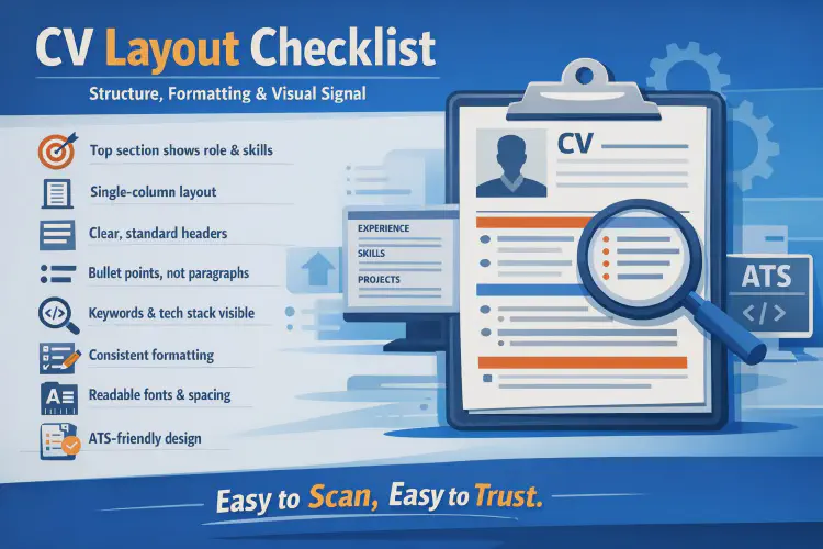
Below is a checklist to verify that your CV layout supports clarity, scanning, and credibility.
1. Put Your Strongest Signal at the Very Top
The top of the first page receives the most attention.
It should clearly show:
- Your name and (optional) role headline
- Contact information and relevant links
- A short profile or summary (if used)
- Key skills or stack overview (if placed high)
If the top section is generic, confusing, or weak, many recruiters will not continue.
2. Use a Simple Layout
The most reliable CV structure in tech hiring is:
- Single column
- Clear section headers
- Predictable ordering
- Consistent spacing
Avoid:
- Decorative sidebars
- Layout tables
- Complex visual structures
Simple layouts are not boring—they are professional and robust.
3. Guide the Eyes From Left to Right, Top to Bottom
Recruiters typically scan in this order:
- Section headers
- Job titles and project names
- Company names
- Bolded keywords and technologies
- First words of bullet points
Your layout should support this scanning behavior, not fight it.
4. Make Your Strongest Section Easy to Find
Your CV structure should reflect where your best proof lives.
Typically:
- Mid-level and seniors → Experience
- Juniors and career switchers → Projects + Skills, supported by education
If your strongest section is buried or hard to locate, your CV underperforms.
5. Use Clear, Standard Section Headers
Good section headers:
- Are visually distinct from body text
- Use consistent formatting
- Use familiar names (Experience, Skills, Projects, Education)
Avoid:
- Creative or vague titles
- Headers that blend into content
- Inconsistent styling across sections
Recruiters rely on familiar structure to move quickly.
6. Prefer Bullet Points Over Paragraphs
Bullet points:
- Improve scan speed
- Highlight actions and outcomes
- Reduce reading effort
Paragraphs:
- Hide key information
- Slow recruiters down
- Are often skipped on first pass
Use short, focused bullets for experience and projects.
7. Keep Keywords Visible but Natural
Recruiters look for fast confirmation of:
- Role alignment
- Stack match
- Tool familiarity
Good keyword visibility comes from:
- A structured skills section
- Technologies embedded in bullet points
- Naming that matches job descriptions
Avoid keyword stuffing—it reduces trust and readability.
8. Prioritize Recency and Relevance
Recruiters value recent, relevant experience most.
They scan:
- Your latest role first
- Your most recent project (for juniors)
- Your strongest technical evidence
Older or less relevant experience should take less space.
9. Use White Space Intentionally
White space is not wasted space.
It:
- Improves scanning
- Separates ideas
- Reduces visual fatigue
- Signals organization and confidence
Avoid compressing everything just to “fit more.” Clarity beats density.
10. Keep Typography Simple and Consistent
Good typography supports readability.
Best practices:
- One primary font
- Clean, modern typeface
- Consistent font sizes
- Bold used sparingly
Avoid:
- Decorative fonts
- Excessive size variation
- Large italic blocks
- Overuse of capitalization
If reading feels like work, recruiters disengage.
11. Make Dates and Timelines Easy to Scan
Dates should be:
- Clearly aligned
- Consistently formatted
- Easy to associate with roles and projects
Do not hide timelines inside paragraphs. Chronology matters.
12. Use Formatting to Signal Importance
Layout communicates priority.
You can emphasize importance by:
- Placing key sections higher
- Giving stronger sections more space
- Keeping weaker sections shorter
If everything looks equal, nothing looks important.
13. Avoid Common Formatting Mistakes
Check for:
- Over-designing
- Inconsistent formatting
- Tiny fonts or margins
- Excessive color use
Formatting should support content—not compete with it.
14. Design for ATS Survival
Even clean-looking CVs can fail technically.
Ensure that you:
- Avoid tables used for layout
- Avoid images for text
- Keep text selectable
- Use standard section names
If an ATS cannot read it, a human may never see it.
15. Use the Right File Format
Best practice:
- PDF by default
- Selectable text (not scanned)
- No image-based PDFs
If Word is requested, comply—but keep formatting simple.
16. Check for “Anchors”
Anchors help recruiters decide whether to continue.
Strong anchors include:
- Clear job titles
- Recognizable companies or projects
- Visible tech stack keywords
- Concrete outcomes or delivery proof
If anchors are missing, the CV feels risky.
17. Do a 10-Second Scan Test
Before submitting, ask:
- Can my role and level be understood in 10 seconds?
- Is my strongest proof immediately visible?
- Is my stack obvious without deep reading?
- Would this survive an ATS scan?
If yes, your layout is doing its job.
👉 Discover our tech training programs
👉 See student reviews and success stories